I always thought that the cover shot of a magazine should make a potential buyer want to snatch it up off the shelf; that it should be of the VERY BEST item that magazine has to offer. It should be titillating, exciting, enticeing, even.
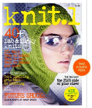
So why, then, does the current issue of Knit1 magazine look like this:

What in the name of all that is holy is THAT?????!!!!!!!!!!!!!!!!!!!!! It looks like a baby-poo green helmet made out of cheap-o cheesy chunky acrylic yarn with a silver doily like the ones grandma crochets tacked over where your ear should be. Practical? No. Fashionable? Umm.....in certain parts of California where people are slaves to/victims of fashion, perhaps. In the rest of the (sane) world? Not on your nelly.
It's HIDEOUS. ATROCIOUS. OBSCENE. It is utterly devoid of any redeeming features; even if it were made out of a higher quality yarn in a different color it would STILL look awful. Whoever designed this.....well, I'm not going to go there.
If that's the best pattern this magazine has to offer then I'm afraid to break it open and look inside, and I sure as heck aint gonna be running out to waste my hard-earned cash on it anytime in the near future.